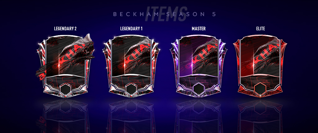

Season 5 was a lot of fun to design, but with a colourful interface it came with some challenges. I wanted to ensure the visual hierarchy was very clear and there was colour contrast for accessibility. I was also responsible for implementation. With the Art Swap Guide I create a couple years ago, I was able to reskin the entire game with minimal Software Engineer support.
HOME
SEARCH POPUP
SQUAD BUILDING
PLAYER LEVELING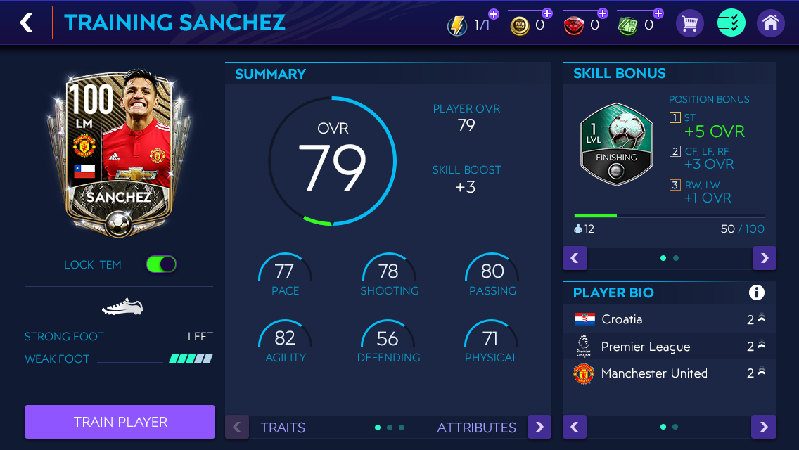
STORE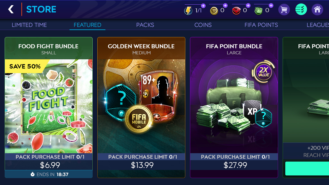
LEADERBOARD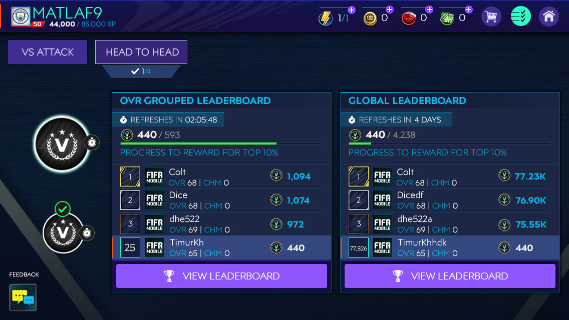
POSTMATCH
GMR DAILY CHALLENGES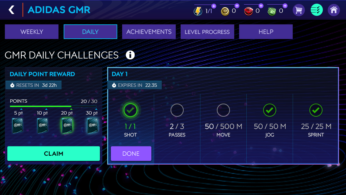
ICON STRIKE CAMPAIGN MAP![]()
TEAM OF THE WEEK RESERVE ITEMS
TEAM OF THE WEEK STARTER ITEMS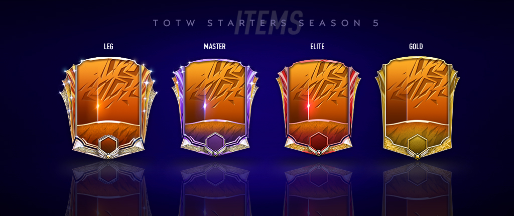
BECKHAM PLAYER ITEMS